When we got the project to make a kollasje at first I
thought it would be very difficult and might look bad. I started working on
this black and white in which I used mostly architectural sketches And a few
drawings. It was
chaotic and it didn’t look good enough to me black and white didn’t give the
expression I wanted my work to have. I was looking around in Photoshop when a
found the function “grid” it was just what I was looking for a grid in which to
cut a series of pictures down in.
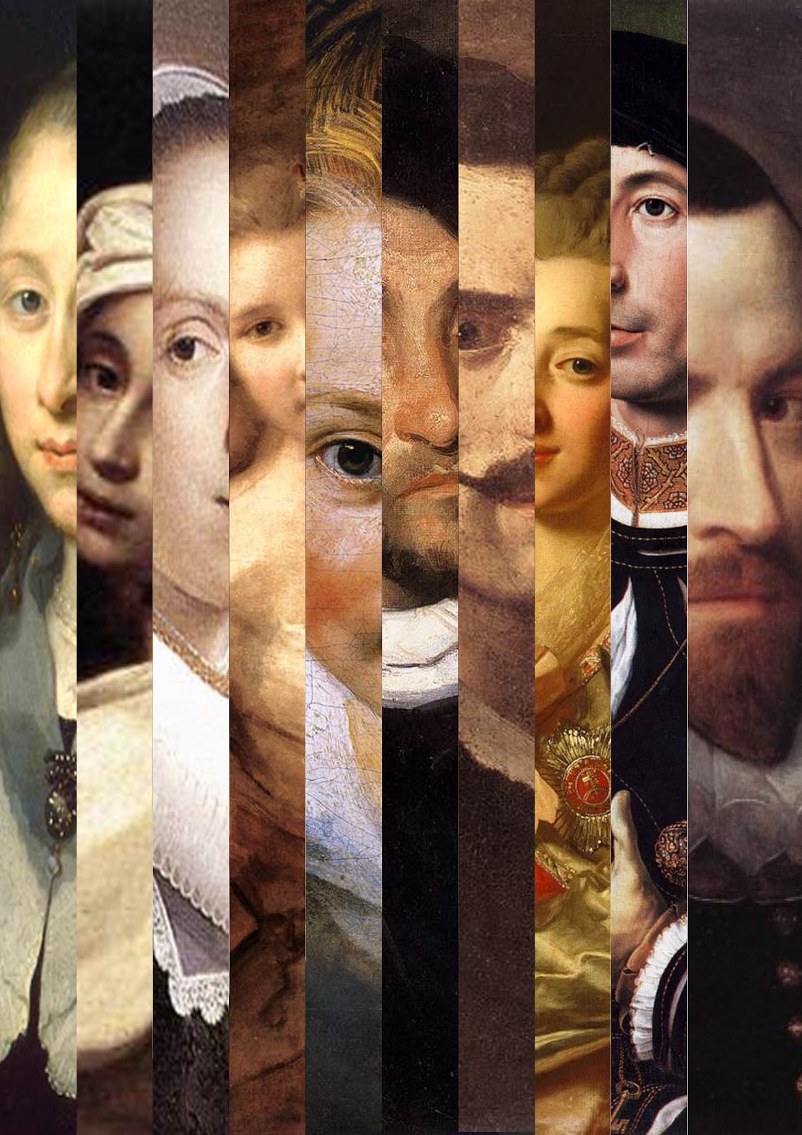
And what it ended out in was this, ten pictures which
each got a space of 6
small boxes. I had to do a little math I divided the 15 big boxes which
consists of 4 small ones 15\10 ended up with 1.5 which means that each picture
got a space of six small boxes.
The theme in this picture is the renaissance. And is
only composed of portraits.


The second picture I made is from the barocken era, and is in the same style as the first one but is vertical lines not horizontal like the first. The picture consists of 10 portraits and all but one get a space of 4 horizontal small boxes.
Because of the composed images contain so much variety of faces different colors composed within each individual image I thought there wouldn’t be just one specific eye catching property of the photos, I couldn’t have been more wrong 4 out of 4 of my classmates tell me that the most eye catching property of the renaissance is the composed face at the top where Mona Lisa is displayed.
The Barocken theme was even easier to find just looking at it you might say you are attracted at every eye in the compile but that might be wrong if I told you to pay attention and you would close your eyes and look again you will notice that the eye number five from left to right is very clear and that picture actually has the highest resolution and that that eye is the lowest laying eye in the picture and that almost all eyes line up for a v shaped line which leads to it.
These might
not be a product you buy at the next art store but more of modern art and if
painted and not fixed in Photoshop you might see this in an art gallery.
The only
material used in this project is 2 A4 sheets and 2 sheets of plastic covering
in which we sealed the pictures in.


Ingen kommentarer:
Legg inn en kommentar